Gravitational Consistency: Why Design Systems Hold Together
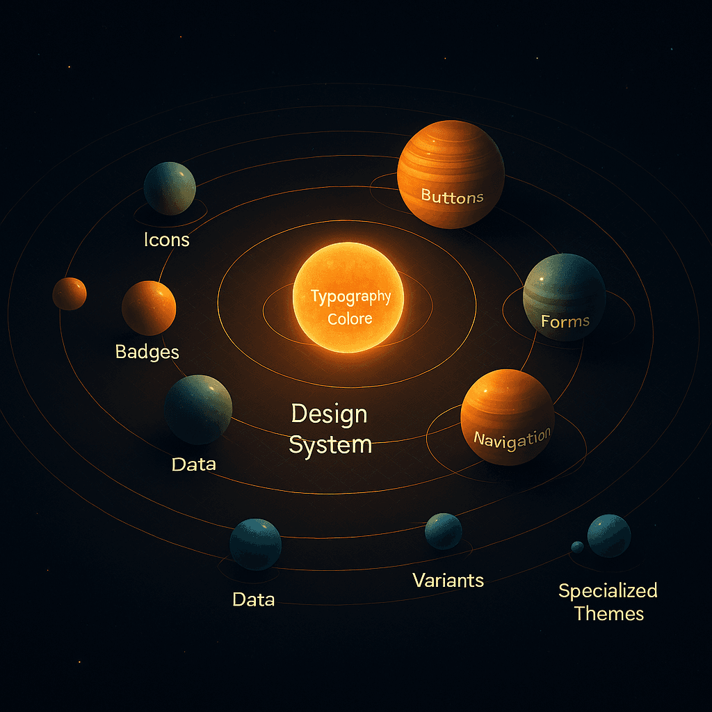
Design systems succeed when they follow a gravitational model: consistent core tokens at the center, colors, typography, spacing, pull everything else into stable orbits. These tokens form the sun, powering component cohesion and visual alignment.
But this pull isn’t just aesthetic, it’s behavioral. Users expect a consistent interface experience. A button that behaves differently on two pages breaks the invisible rules users rely on.
When this central force is strong:
-
Designers make faster, aligned choices.
-
Developers reuse familiar patterns.
-
Stakeholders skip visual debates and focus on outcomes.
Still, too much gravity creates rigidity. Scalable systems allow orbital variation, components that adapt to context without flying off course. This balance between predictability and adaptability is key to avoiding fragmentation or brittle interfaces.
Design systems need ongoing calibration. As products evolve, so must their orbits. Regular refactoring ensures your components remain in sync with brand evolution and user needs like recalibrating planetary paths as cosmic forces shift.
Component Orbits and Scalable Structure
Think of your design system in concentric layers:
-
Atomic components: buttons, inputs, icons closest to the core. Highly reused, extremely stable.
-
Molecular components: form fields, cards, nav items built from atoms, moderately flexible.
-
Organisms/templates: full UI blocks headers, footers, dashboards. Farther from the core, more variation allowed.
This orbit model helps:
-
Predict impact radius of changes
-
Assign ownership tiers (e.g., only senior devs touch core)
-
Create clear versioning strategies across layers
Scaling teams? Then governance becomes critical. Without clear rules, orbital drift sets in: duplicate components, inconsistent tokens, rogue styling.
The solution? Treat core layers like infrastructure stable, slow-moving, semantically versioned. Let outer orbits iterate faster with guided freedom.

Automation: Bridges Between Worlds
Design systems thrive when tools maintain orbital harmony between design and development. Modern automation tools act as data bridges, syncing updates both ways, keeping Figma, Storybook, and codebases in sync.
Key to this system are:
-
Design tokens extracted as variables (CSS, JS, etc.)
-
Component generators from design specs
-
CI/CD + visual regression testing for safe deployments
Tools like Figma Dev Mode, Zeplin, Storybook, and token pipelines (e.g., Style Dictionary) ensure that a change in design cascades to code and vice versa without loss of structure or meaning.
AI now enhances this further by:
-
Suggesting matching components for new designs
-
Flagging inconsistent spacing or typography
-
Helping generate variants that stay in orbit
But beware: misconfigured automation causes decay. Without human oversight, you may generate technically correct but semantically meaningless components.
Best practice? Create a harmonic toolchain:
-
Figma for design
-
GitHub/Storybook for dev + docs
-
CI tools for testing sync
-
Token systems for real-time cross-platform updates
Great design systems aren’t static, they’re self-sustaining ecosystems powered by gravitational consistency and smart automation. When tokens, components, and documentation revolve in harmony, teams design and ship faster with fewer bugs, debates, or inconsistencies.
The key is to respect the system’s physics:
-
Stable core tokens
-
Clear component orbits
-
Bidirectional design-code sync
-
Governance to prevent decay
Like planets around a star, every part of your frontend should know its place and velocity. Get the orbit right, and your system will not only scale but evolve with elegance and resilience.